Dive deep into some of the most common but reliable chart patterns to better spot opportunities in the market!
Experts in every discipline have some sort of toolbox. For many professions, like carpenters and mechanics, the term “toolbox” is literal. For the likes of investors, lawyers, and marketers, “toolbox” is more a figurative term, but it’s just as important.
The most successful investors have an extensive toolbox made up of the right set of best technical indicators and the best chart patterns that can be used to determine future price movements in the market.
As we have already discussed the top 5 technical indicators which can help you to gain your desired output in our previous blog, it’s time now to understand what Chart Patterns have hidden in them for a successful trader.
What are Chart Patterns, and Why Are They Important?
Charts serve as an essential tool for online traders and play a key role in the technical analysis of financial markets.
With the movement of security prices on the chart, patterns are formed, and a pattern is studied by connecting the common price points, i.e. closing prices/highs/lows for a specific period of time.
Traders seek help from patterns to anticipate the future direction of a security’s price. Chart patterns form the strong foundation of technical analysis as they:
- Give a complete pictorial representation of buying and selling happening in the stock market;
- Provide a framework for analysing the battle between bulls and bears;
- Help in making short-term and long-term forecasts.
Types of Charts

There are several chart types that traders use. They all essentially feature the same basic information – price movement across time – but they display it differently and offer different levels of detail.
We are going to discuss three of the most widely used trading charts in detail:
Candlestick Charts
A candlestick chart shows the highs and lows of each unit of time, the top is high and the bottom is the low. A different colour indicates if an instrument closed higher or lower than it opened. Often, Red represents lower and Blue higher.

Bar Chart
It is a type of chart where each ‘bar’ represents a single unit in time: A minute, an hour, a day, etc. It features the opening price, closing price, and highs and lows of every unit of time. The highs and lows are easiest to spot – the highest point of the bar being the high and the bottom of the bar being the low.
A horizontal line on the left of the bar represents the opening price, and a similar bar on the right represents the closing price.

Line Chart
It is the easiest chart to explain. The name says it all – it shows a simple line where each movement represents the movement from one closing price to the next. This type of chart is perhaps the most basic one. So, it has its limitations. However, if you just want to get a clear view of price changes over time, it can be quite useful.

If you’re only just starting on your way through the online trading world, you don’t need to confuse yourself and get overwhelmed with different types of charts. You could get by just fine with the candlestick chart, and that’s the one you will see most often on market news and analysis.
The most important part comes after having a complete understanding of candlestick charts – Chart patterns.
While studying a variety of chart patterns, we need to remember that some patterns are more suited to a volatile market as compared to others. Some patterns are best used in a bullish market, and others are best used when a market is bearish.
They all are used to highlight different trends in a huge variety of markets.
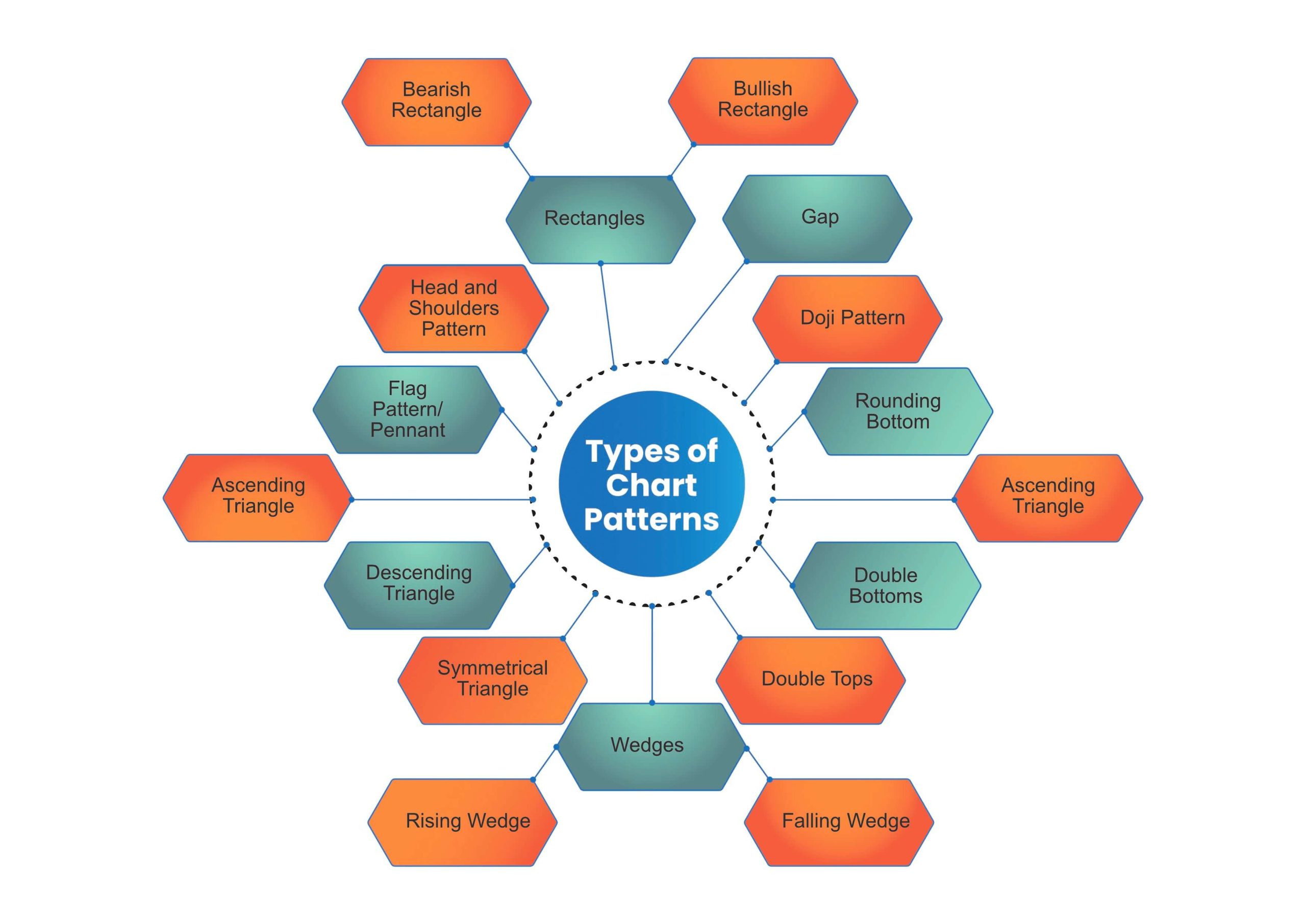
Chart patterns fall broadly into three categories: continuation patterns, reversal patterns and bilateral patterns:
- Continuation patterns signal that an ongoing trend will continue.
- Reversal chart patterns indicate that a trend may be about to change direction.
- Bilateral chart patterns let traders know that the price could move either way, which means that the market is highly volatile and the trader should be ready for any kind of scenario.
Types of Chart Patterns
1. Head and Shoulders Pattern
A head and shoulders pattern is a trend reversal formation.
It arrives after a long bullish trend and is formed by a peak (the left shoulder), followed by a relatively higher peak (which forms the head) and finally a second, low peak (the right shoulder).
Typically, the first and third peaks will be smaller than the second, but they will all fall back to the same level of support, also known as the ‘neckline’. Once the third peak has fallen back to the level of support, it is likely that it will break out into a bearish downtrend.

In short, the Head and Shoulders pattern is a bullish to bearish reversal pattern that has a large peak in the middle and two smaller peaks on either side resting on a neckline.
2. Flag Pattern/Pennant:
As the name suggests, this pattern looks similar to a flag or a flagpole. After a sharp price movement, either upward or downward, when the prices enter a consolidation phase, then the flag pattern may be formed. It basically indicates that the prevailing trend is going to continue. When the prices are in an uptrend, a bullish flag pattern shows a slow consolidation lower after an aggressive uptrend. When the prices are in the downtrend, a bearish flag pattern shows a slow consolidation higher after an aggressive downtrend.

The flag stock chart pattern is shaped as a sloping rectangle, where the lines run parallel until there is a breakout. The breakout is usually in the opposite direction of the trendlines, meaning this is a reversal pattern. The unique part of this pattern is that it allows traders to enter the market in the middle of the trend.
3. Ascending Triangle:
An ascending triangle is typically viewed as a bullish pattern, indicating the price of an instrument will move higher once the pattern is complete. This type of triangle is created from an ascending trend line serving as a price Support {it is a price level where a downtrend can be expected to pause due to a concentration of demand or buying interest} and a flat trend line serving as a point of Resistance {it arises due to selling interest when prices have increased}.
Ascending triangles often have two or more identical peak highs that allow for the horizontal line to be drawn, known as resistance. The trend line signifies the overall uptrend of the pattern, while the horizontal line indicates the historic level of resistance for that particular asset.

4. Descending Triangle:
A descending triangle is exactly the opposite of the ascending triangle. It is viewed as a bearish pattern, indicating the instrument’s price will move down, once the pattern is complete.
It’s composed of a downward-sloping resistance line and a relatively flat support line, which the price cannot seem to break.

5. Symmetrical Triangle:
Symmetrical Triangles can be bullish or bearish continuation chart patterns that are developed by two trend lines convergence.
It is made from the convergence of an ascending support line and a descending resistance line. Typically, the price of the instrument will bounce between the trend lines, moving closer and closer to the apex (that’s the name for the point where the two lines meet), before breaking out in the previous trend’s direction.
The symmetrical triangle is often viewed as a continuation pattern, signalling a period of consolidation of a specific trend before it resumes.

6. Wedges:
In technical analysis, a wedge signals a pause in an existing trend. Wedges can be either reversal or continuation patterns.
There are two main types of wedges:
(a)Rising
When a price consolidates between upward support and resistance lines, this results in a rising wedge pattern.
According to the theory, if the rising wedge pattern is created following an uptrend, it could signal a continuation. Note that because a rising wedge pattern indicates a possible downtrend (in theory, of course), it can be viewed as a bearish chart pattern.

(b) Falling wedge
A falling wedge pattern can serve as a continuation or reversal signal.
As a continual, it’s formed during an uptrend, suggesting the upward price movement could resume. As a reversal, it is formed at the bottom of a downtrend, serving as an indicator that an uptrend could appear next. An uptrend, making the falling wedge pattern a bullish chart pattern.

7. Double Tops:
A double top is a bearish reversal pattern which follows an extended uptrend. The ‘tops’ are similar-sized, consecutive peaks formed when the price hits a certain price level and can’t break out.
First, the price moves up to the price level. Then, it bounces down slightly before returning to the price level. Once it bounces down again, the chart forms a double top.
Just imagine a kind of camel hump!

According to theory, double top reversal usually suggests a certain change, sometimes a long-term change in trend, indicating a possible move from bullish to bearish. This is why some investors look for double tops following a significant uptrend.
8. Double Bottoms:
Much like double tops, the double bottom is a trend reversal formation. The difference is that in this case, the two ‘peaks’ are actually two ‘bottoms’. A double bottom looks a bit like the letter W, made up of a drop in the price of an instrument followed by a rebound, then another drop to a similar price level followed by a second rebound. It is basically a bullish reversal pattern.

The bottoms are created when the price can’t seem to break a specific level, which is referred to as a “resistance level”.
9. Cup and Handle:
Also known as ‘cup with handle’, this chart pattern is composed of a drop in the price, a bounce back to the original price, and then a smaller drop followed by a price rise beyond the previous peak. The resulting pattern looks a bit like a teacup – a U shape followed by a slightly downward “handle”. A cup and handle pattern is viewed, in theory, as a bullish continuation pattern used to identify potential buying opportunities. This formation is viewed as significant only when it follows an upward price trend, especially a trend that lasts for no more than a few months. When spotting cups and handling patterns, technical analysis investors often consider the length, depth and volume of the pattern.
For example, cups with a longer, more U-like shape (unlike a V shape) are viewed as stronger signals.
10. Rounding Bottom:

A rounding bottom or cup usually indicates a bullish upward trend. Traders can buy at the middle of the U shape, capitalising on the bullish trend that follows as it breaks through the resistance levels.
11. Doji Pattern:
A Doji is a name for a session in which the candlestick for a security has an open and close that are virtually equal and are often components in patterns. Doji candlesticks look like a cross, inverted cross or plus sign. A doji candlestick forms when a security’s open and close are virtually equal for the given time period and generally signals a reversal pattern for technical analysts. In Japanese, “doji” means blunder or mistake, referring to the rarity of having the open and close price be exactly the same.

12. Gap:
A gap is simply a break between prices on a trading chart. Gaps are created when the price of an instrument makes a sharp up or down move, with no trading taking place in between. Reasons for gaps include earnings reports, major news releases or just regular trading. Sometimes, a gap is created when relevant breaking news occurs over the weekend, leading to a surge – or a crash – in the price, once the market reopens.
13. Rectangles

We’ve had triangles, wedges and gaps. Now, it’s time to talk about rectangles. This chart pattern is formed when the price moves between parallel support and resistance levels.
- Bearish rectangle
In a bearish rectangle, the price stays relatively flat – for a little while – during a downtrend, before continuing the trend (in theory of course).

- Bullish rectangle
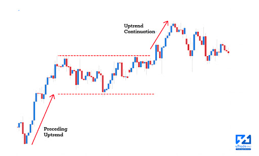
You can probably guess what this rectangle is about. During an uptrend, the price stays relatively flat (or consolidates) for a while before it continues in the original direction.

Chart patterns are just as important to predicting price movements as a hammer is to nailing a shingle to a roof. Without them, the investor would essentially be blind, making moves on gut instincts and gambling with their money.
All of the patterns explained in this article are useful technical analyses which can help you to understand how or why an asset’s price moved in a certain way – and which way it might move in the future.
Using popular patterns such as triangles, wedges and rectangles, coupled with uTrade Algos, you can do wonders in this roller coaster journey of trading.
To Summarise,

Now that you know so much more about chart patterns, why not try making your first automated trading algorithm on uTrade Algos?
Chart patterns are formed by connecting the common price points, i.e. closing prices/highs/lows for a specific period of time
Chart patterns form the strong foundation of technical analysis and give a complete pictorial representation of buying and selling happening in the stock market
There are several types of charts: candlestick, bar and line
Candlestick charts are the most commonly used chart and are quite popular among traders
Chart patterns fall broadly into three categories: continuation patterns, reversal patterns, and bilateral patterns
Head and Shoulders pattern is a bullish to bearish reversal pattern that has a large peak in the middle and two smaller peaks on either side resting on a neckline
Flag pattern is shaped as a sloping rectangle, where the lines run parallel until there is a breakout
Traders can anticipate the future direction of a security’s price by studying chart patterns
If you’re interested in exploring technical analysis and chart patterns further, visit uTrade Algos and sign up for our platform today!

 April 5, 2023